
and Controls
Screen Shapes and Controls Explained
Shape
Element
- below is a list of available shapes which can be used in
scenes.
- create new shapes which you can add to any scene.
- almost everything in the application can be done by
right-clicking a shape element and choosing the desired option from the
contextual menu which appears.
- add an unlimited number of shapes (either existing shapes or
custom created shapes) to build complex scenes.
- while building a scene there is no limit to how big the scene can
be and this is because any shape can go beyond the display size in any
direction.
- duplicate any scene as many times as you want thus going from a
single shape on screen to as many as you need.
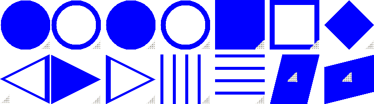
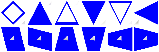
- these are all predefined shapes which come
together with the application after it is installed.
- each shape has a draggable "corner" usually
situated at the bottom right corner of the shape (sometimes it is situated in
other sections as well).
- drag this corner in any direction you want in
order to increase or decrease the size of your shape.
- there is an option to hide this corner
and hidding it would be especially usefull when you want to save a snapshot of
your scene but you don't want any draggable corners to appear in your saved
snapshot.
- change the color of any shape
element.
- change the background
image of any shape element.
- change the opacity of any shape
element.
- change the click-through state of
any shape element: click-throughable or click-aware.
- add a text in any shape
element
Choose
Shapes
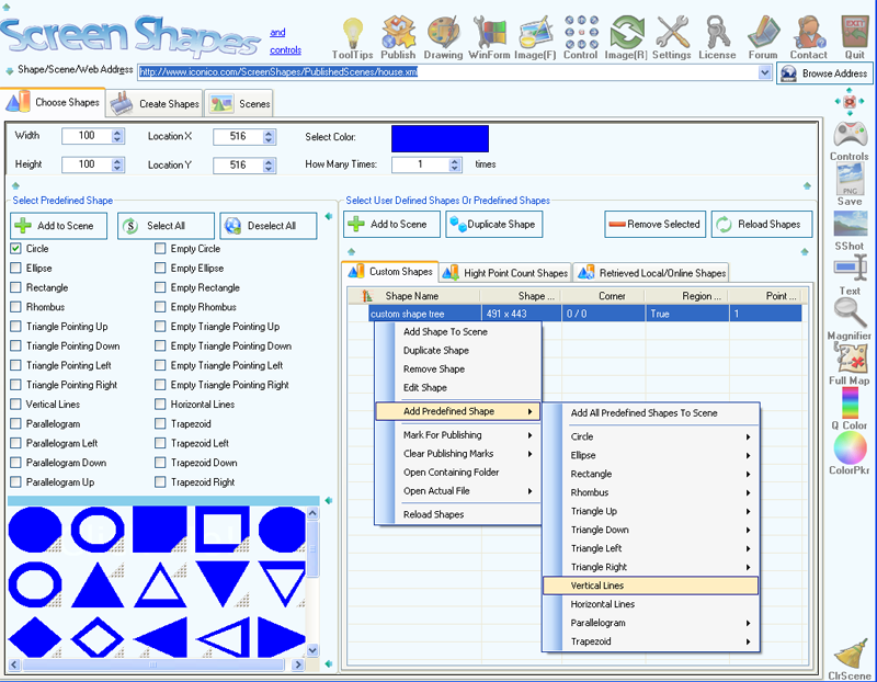
- initially the only visible thing in the
"Choose Shapes" tab is the custom shapes list where you can select predefined
shapes or existing custom defined shapes to add to your scenes. All the other
elements of this screen are (initially) hidden and then can be toggled
(visible/hidden) using the  button (top
right section).
button (top
right section).
Create
Shapes
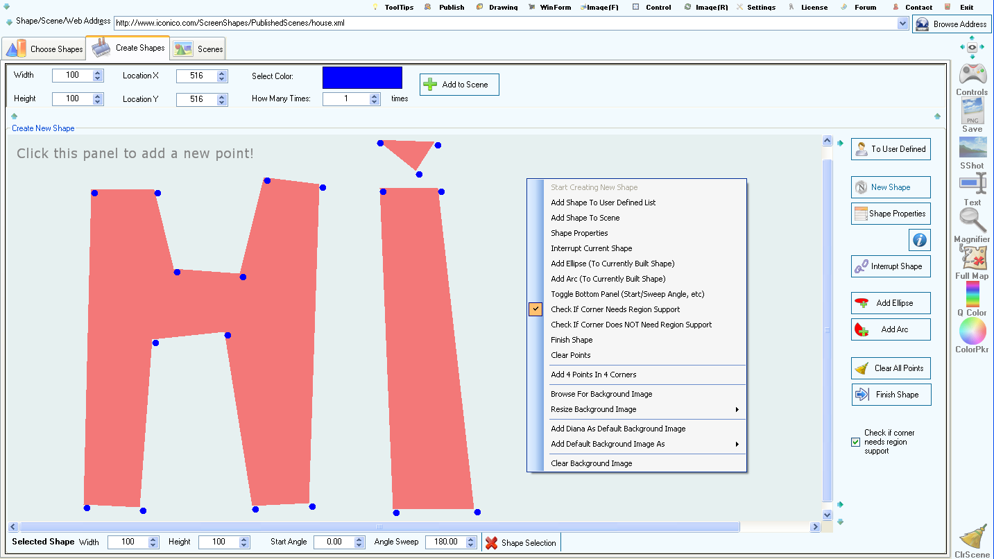
- here you can create your own shapes by
clicking inside the big panel to add new points. You can interrupt a group of
points by choosing the "Interrupt Current Shape" menu option or pressing the
"Interrupt Shape" button.
- change the name and the file name of the shape
by choosing the "Shape Properties" menu option or the "Shape Properties"
button.
- add ellipses or arcs to your shape by choosing
the appropriate menu option or button.
- at any time in the creation process you can
clear all your points from the panel by pressing the "Clear Points" menu option
or "Clear All Points" button.
- if the draggable corner of your shape is
situated on a point group then make sure that the "Check if corner needs region
support" check box is not checked. If the draggable corner is situated outside
of any point groups then make sure that the "Check if corner needs region
support" check box is checked. This is to ensure it's visibility when the shape
is rendered.
- once
your created shape is finished you can press the "Finish Shape" menu option or
the "Finish Shape" button.
- add the shape to the custom shape list within
the "Choose Shapes" tab by pressing the "Add Shape To User Defined List" menu
option or the "To User Defined" button. Anytime in the creation process you can
add the shape to the custom shapes list but each time will overwrite the
previously added shape.
- choose the "Add 4 Points in 4 Corners" option
to create a region which covers the entire panel surface. Then add other points
inside the panel and these points will form regions which will be left out when
the shape is rendered. This is because when two point groups will intersect,
their intersection will not be rendered in the actual shape (you might even
think that those point groups cancel each other out where they
intersect).
- add your own background image to the panel or
one of the default background images. Using a background image on the panel
allows you to create shapes based on different objects inside that image:
simply click the outline of an object inside the background image.
- there are also other options that can be used
while creating shapes and to access them you need to right click an existing
point contained in the panel:
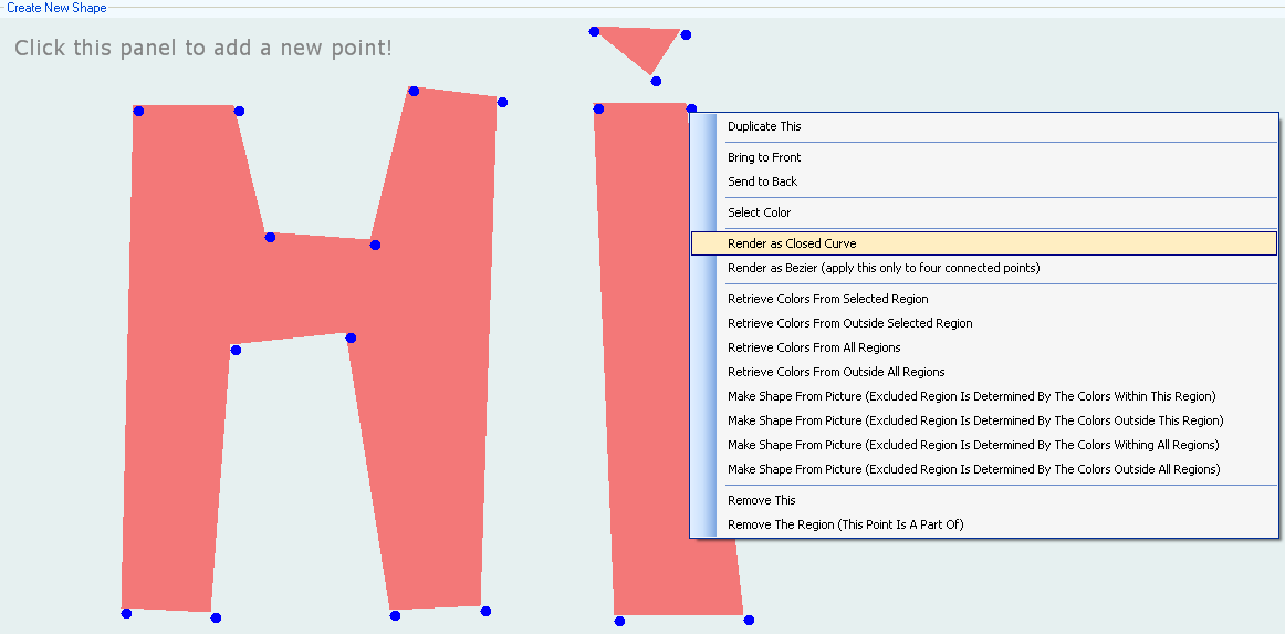
- these options allow you to duplicate a point,
select its color, render the region the point is part of as a "Closed Curve" or
as "Bezier". It also allows the retrieval of colors from the background image
based on the region that point is part of (or based on all regions). Other
options allows the creation of shapes based on the selected background image and
based on the region that point is part of (or based on all regions).
Scenes
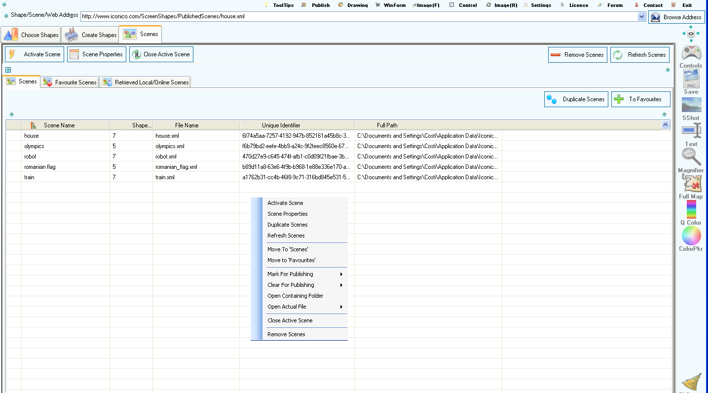
- there are three list containing scenes. The
first one ("Scenes" smalller tab) stores any scene you are saving. The "Favourte
Scenes" tab stores any scenes you like the most and is provided there as an
extra storage section. The "Retrieved Local/Online Scenes" tab stores scenes to
which you browse using the application integrated browser. You can move any
scene from any section to any other section.
- there are certain operations like moving a
scene or deleting a scene which cannot be performed on the currently
active scene on screen. First you would have to close the active scene using
either the "Close Active Scene" menu option or the "Close Actiev Scene" button
and then you can perform those operations on the scene.
- you can delete or duplicate scenes.
Image, Shape and Scene
Browser

- enter a web site address in the
top combo box and press the "Browse Address" button to browse to that
web site and gather images from its web pages.
- enter a shape URL address and press the
"Browse Address" button. This will retrieve the shape and store it in the
"Choose Shapes" tab -> "Retrieved Local/Online Shapes" list.
- enter a scene URL address and press
the "Browse Address" button. This will retrieve the scene and store it in
the "Scenes" tab -> "Retrieved Local/Online Scenes" list.
Drawing on
Shapes
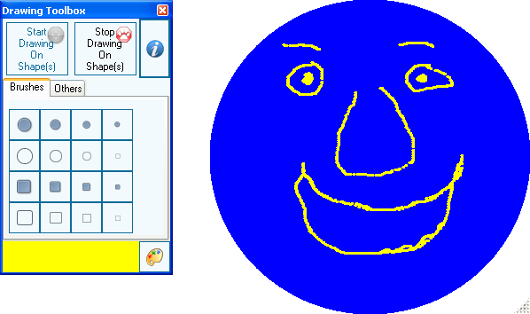
- the "Drawing Toolbox" can be started from the
top menu by pressing the "Drawing" button.
- to draw on shapes the "Start Drawing On
Shape(s)" button must be pressed (the button is in the "Drawing Toolbox"
window). Then use the right mouse button to make your drawing.
- to stop drawing on shapes press the "Stop
Drawing On Shape(s)" button from the "Drawing Toolbox" window.
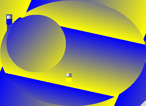
- the "Enable Gradients On Shape" button adds
two controls which you can drag around inside your shape to establish the origin
points of a gradient (see the "Others" tab inside the "Drawing Toolbox"). Based
on the location of those two controls you can draw linear, rectangular,
circular and full circular gradients (right click any of the two controls to
draw the gradient). The gradient colors are the background colors of these two
controls. Each gradient is drawn on top of what is already drawn in the
shape and you can have as manu gradient control pairs as you want. To remove a
gradient control pair simply right click one of the controls and choose the
"Close" menu option. Here is an example of a drawing containing
gradients:
- it is important to know that any shape
initially does not have a background image. When changing the background color
of that shape using the color pickers, the background color of the control is
changed (not the color of the background image). And because the background
image is on top of the shape's background, you won't see any color changing when
the shape has a background image and you're using the color pickers to change
the shape's color. You would first have to remove the background image of that
shape and then try to change the background color using the color
pickers.
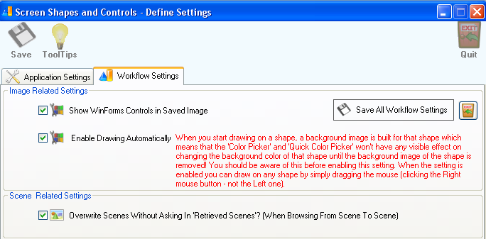
- when something is drawn on that shape, the
shape is automatically assigned a background image and all drawings are done on
that background image.
Image Filters for Shapes
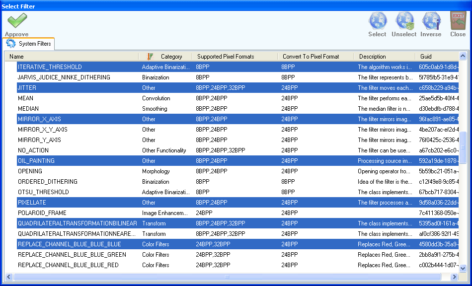
- the application is released with 128 image
filters which can be applied to the background image of any shape.
- here is a trick: add a shape to your screen,
add a background image to that shape, then open the "Image Filters" window and
select a few filters (for example select the "REPLACE_CHANNEL_" filters) and
then right click the shape and choose the "Duplicate Shape" -> "And Apply
Each Selected Color Filter" menu option. This will duplicate your shape as many
times as image filters you have selected and will filter the original background
image using each selected filter and assign the filter image to each
duplicate. This way you'll get the original image filtered using the image
filters you've selected.
Image
Rotation Control
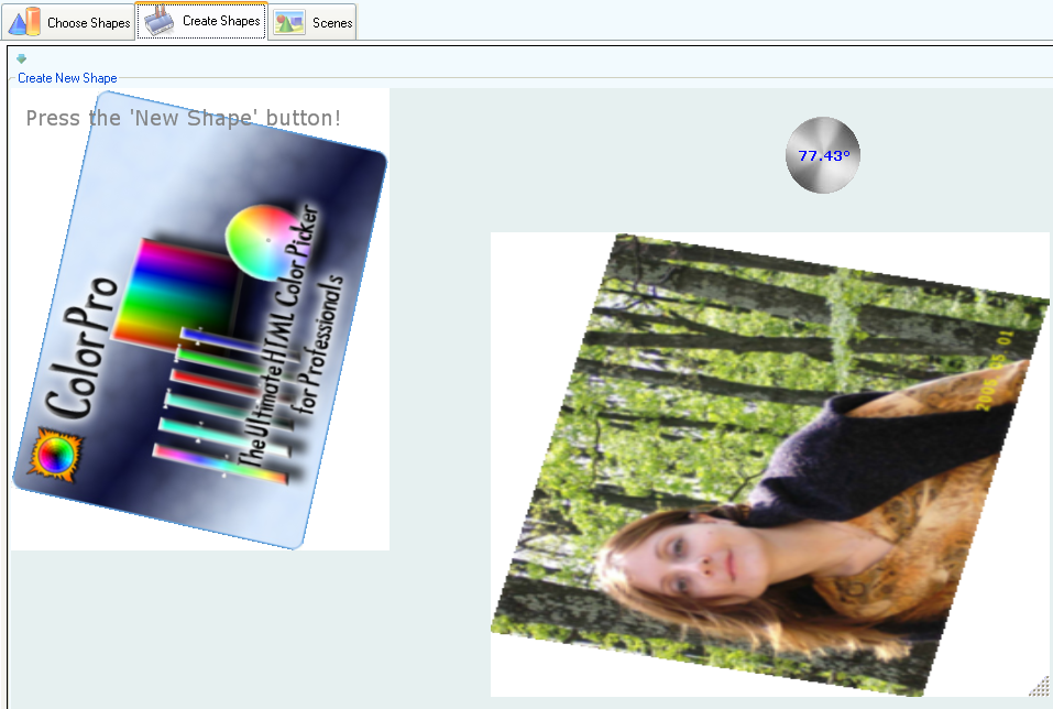
- the image rotation control works
on the background image of the "Create Shapes" tab or on the background image of
last clicked shape. Simply activate it by pressing the "Image(R)" top menu
button and once it is visible, dragg it around to rotate the background image.
You can even type an angle and hit Enter if you have a certain angle in
mind.
Windows Forms
Controls Integration
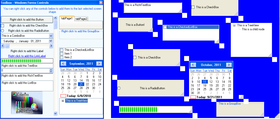
- any shape supports Windows Forms controls to
be added on its surface.
- to add a Windows Forms control on a shape you
have to first click on the shape and then right click any Windows Forms control
in the "Toolbox - Windows Forms Controls" window. From there select the "Add
This Control" menu option.
- the available Windows Forms controls you can
add to any shape are: Button, CheckBox, RadioButton, ComboBox, DateTimePicker,
HScrollBar, Label, LinkLabel, ProgressBar, TextBox, NumericUpDown, RichTextBox,
ListBox, PictureBox, TabControl, GroupBox, Panel, CheckedListBox, Calendar and
TreeView.
- each Windows Forms control can be right
clicked to show a contextual menu:
- only the first level of Windows Forms controls
support having other Windows Forms controls added inside them. To add a new
Windows Forms control into an already added (first level) control on a shape you
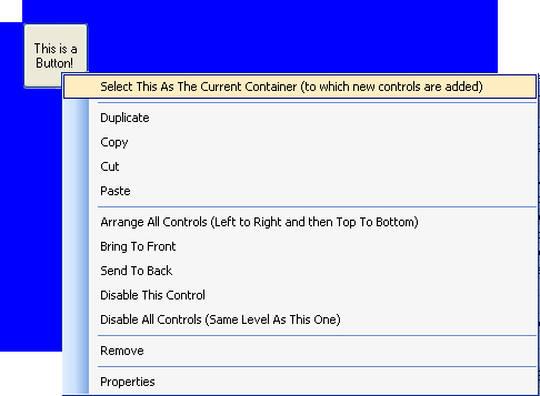
would have to right-click your (first level) control and choose the "Select This
As The Current Container (to which new controls are added)" menu option and then
to add the new control(s) from the Windows Forms Controls Toolbox.
- to move a Windows Forms control you can either
drag its white corners or disable it and drag the control itself. To enable the
control again you would have to right-click either one of the associated white
corners and select the appropriate "Enable" option.
Scene
Controller
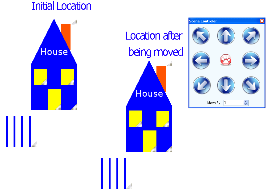
- the "Scene Controller" can be started
using the "Control" top menu button.
- it moves all shapes in the current scene in
the direction indicated by the big button arrows.
- the "cat paw" button stops the scene from
beeing moved.
- the "Move By" numeric text box specifies by
how many pixels each shape is moved into the indicated direction.
Publish Shapes and Scenes
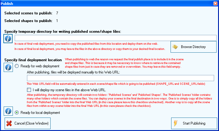
- the "Publish" window is shown by pressing the
"Publish" top menu button.
- it looks for all the shapes and scenes
(normal, favourite or retrieved) which are marked for publishing and will
publish only those scenes. Each shape and scene list has a menu option allowing
you to mark a shape or scene for publishing and also to clear that
mark.
Settings
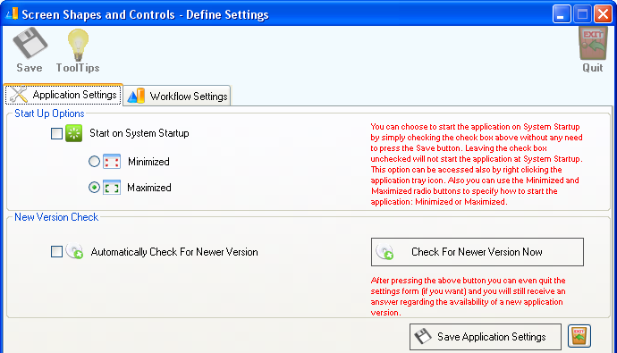
- the way the
application is started can be controlled using the "Start on System Startup"
check box. If this is not checked then the application will not start
automatically at System Startup. If it is checked then you can start the
application in two ways:
- Minimized - this will
put the application in the system tray
- Maximized - this will
show the application on the screen (minimizing it will send the
application to Windows Tray)
-
press the "Check For Newer Version Now" button to check if a newer version for
the application is available. If such a new version exists then a
possibility to open the download page for the newer version is given.
- the "Workflow Settings" tab is shown below:
Go To Top